Warehouse Equipment Manufacturing Company Website UI and Layout Template Design
For a warehouse equipment manufacturing company, an effective English website must be professional, robust, and user-centric, reflecting the industrial strength and technical precision of the products while ensuring clear communication with a global B2B audience. The following outlines a comprehensive UI and layout template design.
Core Design Principles:
- Professional & Industrial Aesthetic: Utilize a clean, modern color palette. Deep blues, dark grays, or charcoal paired with crisp white and strategic accents of a bold color (like orange, green, or blue) for CTAs and highlights. Imagery should feature high-quality photos and videos of equipment in action within real warehouse settings.
- Clarity & Usability: Navigation must be intuitive. Information architecture should logically guide visitors from understanding the company to exploring products and initiating contact. Typography should be highly legible (sans-serif fonts like Roboto, Open Sans) with clear hierarchies.
- Trust & Authority: The design must convey reliability. This is achieved through showcasing certifications, client logos, case studies, and detailed technical specifications.
Proposed Page Layout Templates:
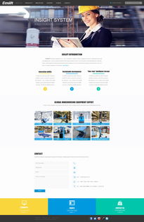
1. Homepage:
Header: Fixed navigation bar with logo, clear menu (Home, Products, Solutions, Industries, About, Contact), and a prominent "Request a Quote" button. Language selector.
Hero Section: Full-width impactful video or slider showcasing flagship equipment with a strong headline (e.g., "Engineering Efficiency for Modern Warehouses") and a primary CTA ("Explore Our Solutions").
Value Proposition: Three or four icon-based cards summarizing key strengths (e.g., "Durable & Reliable," "Custom Engineering," "Global Support").
Featured Product Categories: Grid or carousel display of main product lines (Shelving, Conveyors, Forklifts, Automation) with images and "Learn More" links.
Client Highlights/Trust Signals: A subtle section displaying logos of reputable clients or partners.
Footer: Contact info, quick links, newsletter signup, social media icons, and privacy/legal links.
2. Product Category / Catalog Page:
Layout: Clean grid or list view of products within a category. Each item should have a sharp image, product name, brief key feature list, and a "View Details" button.
Sidebar Filtering: Allow users to filter by specifications (load capacity, dimensions, material) or application.
* Breadcrumb Navigation: For easy backtracking (Home > Products > Storage Shelving).
3. Product Detail Page:
Gallery: Multiple high-resolution images with zoom functionality and possibly a 360° view or video.
Key Specifications Table: Clearly presented technical data.
Features & Benefits: Bulleted list in a scannable format.
Downloadable Resources: Links to PDF datasheets, CAD drawings, and manuals.
Related Products: Suggestions at the bottom.
Sticky CTA Sidebar: Persistent "Contact Sales" or "Request a Quote" form/button.
4. Solutions/Industries Page:
* Layout: Use cards or dedicated sections for different industry verticals (e.g., E-commerce Fulfillment, Cold Storage, Automotive) or challenges (Space Optimization, Order Picking Speed). Each section links to relevant product collections and case studies.
5. About Us Page:
* Structure: Combine the company's mission/vision, history timeline, quality certifications, and team photos to build credibility.
6. Contact Page:
* Layout: A two-column design with a contact form (Name, Company, Email, Phone, Inquiry Type, Message) on one side and detailed contact information (HQ address, phone, email, regional office links, map embed) on the other.
UI Components & Responsiveness:
Buttons: Consistent, bold styling for primary actions; secondary buttons for less critical actions.
Forms: Clean, clearly labeled fields with appropriate validation.
Icons: Use a consistent icon set (like Font Awesome) for features and benefits.
Responsive Design: The entire template must be fully responsive, providing an optimal experience on desktops, tablets, and mobile devices. The navigation should collapse into a hamburger menu on mobile.
Overall, this template design focuses on marrying a strong, trustworthy visual identity with a logical structure that makes it easy for potential B2B customers to find technical information, understand product value, and take the next step in the sales process.
如若转载,请注明出处:http://www.xingjiushen.com/product/72.html
更新时间:2026-06-19 16:02:22